
Tabular Results Presentation Pane
Following the Tab selection (setting the analysis pivot), all records matching the Tab's dimension (data field, criteria) will be added to the Filter's Data Content Table included in the Tabular Results Presentation Pane, in which each row represents an occurrence matching the Tab.
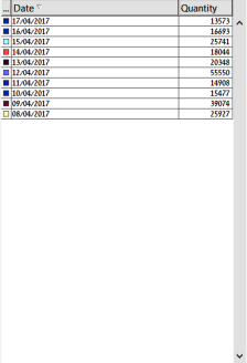
The left column of the table details the occurrence and the right column quantifies that occurrence.
The following figure demonstrates the Table Presentation in which the Date Tab was selected and quantities of occurrence are counted for each date matching the selection criteria.
The leftmost column shows relevant color for the occurrence as presented in the Graphical Results Presentation Pane.
The column to its right shows the items relating to The Dimensions' Tabs.
The rightmost column shows the number (quantities) of occurrences for each item row of the table.
For further analysis of the data, each (or a few) of the table's rows can be selected to create a new filter definition/combination, by holding down the keyboard's button and clicking with the mouse on the row to be selected.
The new filter definition will also be updated in the Filter Definition Pane and Selection Tabs.
|
|
Note: |
Visualizer works with a statistical file created as a batch process in the IBM i. Therefore, all dates listed in the Date dimension (set as the default option) in the Data pane will be from when the first entries were made to the system. |